Introduction to the Design Principles
While teaching our Digital Arts and Entertainment students, a big part is focused on the principles of design, i.e. 'How to make an image more pleasing and appealing? - i.e. 'How do I make something cool?'I was thinking of a way to explain those principles in a clear and understandable way to my students and was looking for this perfect example. One day it suddenly struck me. Every day I pass by this facility when getting to work. It shows the principles of design in all its beauty:

Probably it seems I don't make sense at all but things will get clear soon...
When I talk about contrast it applies on certain differences between shapes, textures, details, heights, orientations,...
By having Contrast you end up with Variety. Having Variety and Contrast makes for Interesting designs.
Interesting designs = cool
Over the years I was able to build a list of principles based on my own experiences and others (see the resources at the bottom of this post), that will help you get contrast and variety in your designs and hopefully one step closer to a successful end result.
Proportions and 70/30 - 80/20 rule
Readability and Functionality
Overlap and Multi-layering
Design line and Stance
Silhouette
Shading and form
Symmetry and Asymmetry
Rhythm and Repetition
...

Let me go over some of the principles and explain to you why this is a sexy image
Some of the Design Principles explained in depth
Proportions and 70/30 - 80/20 rule
This principle is all about Big, Medium and Small. Applying this rule will automatically result in contrast and variety of shapes. The principle can be applied on shapes, lines, details... and even on value patterns. To give you a brief example, you want to avoid having 33% white, 33% grey and 33% black in your image. A better arrangement could be 10% white, 30% grey and 60% black. (I hope to go deeper into this in another post).There will be no similar sized shapes, therefore they are not competing for attention which will result in a clear focus point.
A connected principle to Proportions is the 70/30 rule. You could call it the 71/29 rule if you want to, hence why I wrote 80/20 rule as well. It comes down to this: to have contrast and variety you want to avoid a 50/50 arrangement where everything is the same size or length. The picture bellow will clarify what I mean:

The doors on the left trigger the interest of the viewer because there is a variation in sizes. In the example on the left, I lowered the the height of one door, resulting in a less interesting design. One could argue that the door on the left is still interesting because of the overlap the railing is creating and they would be totally right about that ;-).
Readability and Functionality
Readability and functionality are important principles to keep in mind, especially when designing functional objects like vehicles and machines. Good readability can come from a strong silhouette or from good distribution of detail like shown in the picture below. You don't want to detail everything but leave empty spaces between areas that matter. That way your viewer has areas for his eyes to rest. It is in these detailed areas that you add functionality to your designs. I.e. you add details to explain how something works.
Functionality adds existing elements to your design to make the concept understandable and believable enough for the viewer to understand. More then often I encounter designs that lack simple details around areas where to objects meet or are connected with each other, resulting in a 'glued together'-feeling. All it takes is some detailing around those areas to make the design more readable and functional.

Just by adding some minor details on places where at matters (eg. pivot points), we make this design more readable
A side note to this principle: Maybe you're familiar with the phrase 'Form follows function' or 'Function over form'. As an example; a fast going vehicle will be more designed because it has to be aerodynamic in order to go fast. The focus will be on the design. Whereas a heavy construction vehicle will be less designed and has a bigger focus on functionality.
It's important to find a nice balance between design and function so you strive for a pleasing aesthetic feeling.
Silhouette
To put this simple; a silhouette is the black and white version of your design so we can focus on the contour of the design. By filling up the shapes of your design you can check if the design and functionality are still readable and understandable. You can ask yourself if 'it has interesting ins and outs, do I have negative spaces and is the design still readable from afar?'
In drawing you want to avoid flat and long endless lines and shapes without anything happening to it. I often times compare it with a heart beat on a monitor. Flat lines are lifeless, the heartbeat itself expresses life and interest.

Rhythm and Repetition
Rhythm and repetition will create a certain flow in your design that you can use to lead the viewer in a certain direction and ties everything together as a whole. You can easily compare it with music notes. When a musician would randomly play some notes it would sound clueless and indecisive, whereas the musician ties everything together smoothly it becomes this beautiful composed masterpiece.E.g. Repetition can be a repeated circular shape in your design that gently leads the viewer through your design. Within the repetition of elements you want to make sure to put variation as well by changing the sizes or orientations.
Design Principles in practice
As you may have noticed it is not necessary for you to try and include all these design principles in your designs. You have to decide for yourself which principle will help you to enforce a certain mood and feeling. The principles that always stand by me when fighting design problems are : Proportions, Overlap, Design line, Silhouette and Shading (i.e. PODSS). Learn this abbreviation by heart and it will become your design-saver for life, trust me! ;-).So how does all of this apply to art and design in particular? Let me explain with the following design and let us see how PODSS can be of any help to us:

What I dislike about the design and want to change:
- Proportions are too alike
- Maybe the design line / stance could be improved on to get more character in the design
- The functionality is lacking, i.e. We don't understand how the legs would function
- The silhouette is not on its best. Interesting ins and outs can be used to show the functionality of the design better and rotation/pivot points
- The object looks flat and misses volume, applying some shading and having overlapping elements could fix this.
What I like about the design and want to keep:
- The figure, it definitely sets a scale for us so we understand the design better
- The ground line, the vehicle looks grounded and in place
- The details, they tell us a bit more about the history and story of the design
- The long leg in the front gives it a certain 'dragging or crawling' vibe. Maybe we want to keep that feeling
- The repetition of the circular elements are creating a certain flow through the design
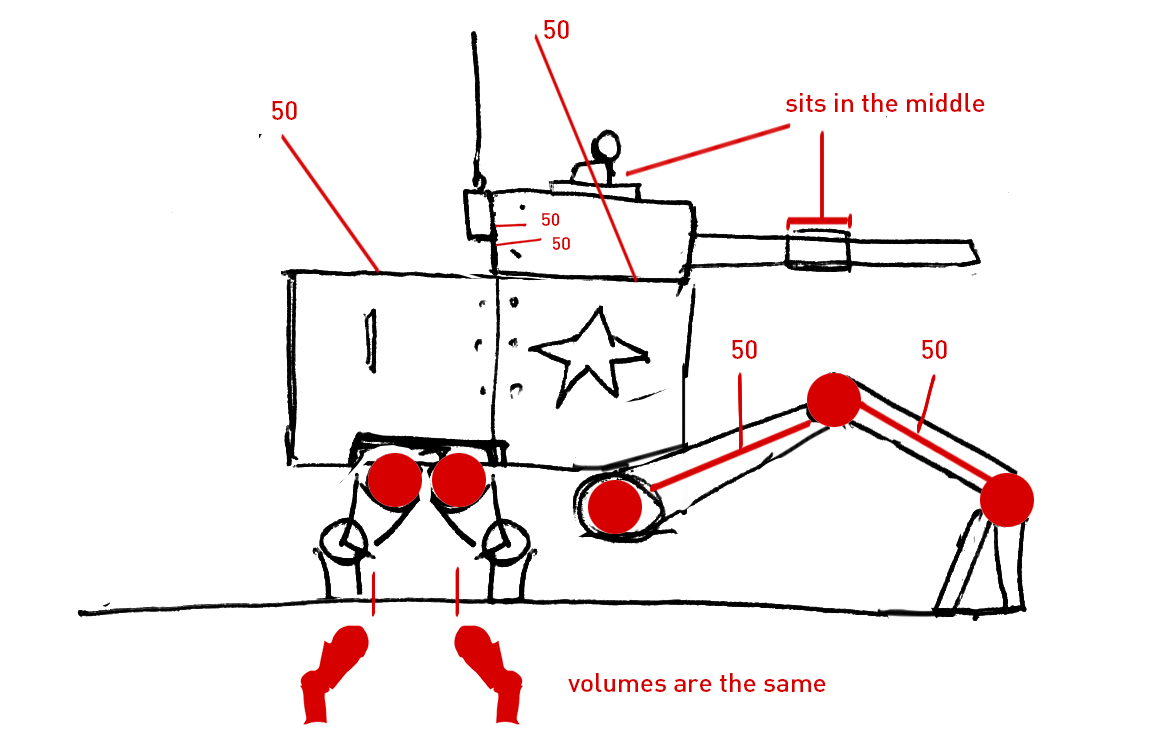
We should address the proportions first. By applying the Proportion and 70/30 rule we can make this design more pleasing:


In conclusion
Hopefully you're able to incorporate some of the principles in your own work from now on. To make things easier, I created a 'Design Poster' for you to download. It fits on an A4 so it's ready to print out and to be put on your refrigerator :-).Please share if you have more resources available on this topic in the comment section. I would love to hear about them. Personally I found following website and book quite helpful:
Resources:
-THUMB WAR: Design Iteration Combat Simulation by Paul Richards: https://www.autodestruct.com/thumbwar.htm : Please check this and the rest of his blog out!
-Universal Principles of Design, Revised and Updated: 115 Ways to Enhance Usability, Influence Perception, Increase Appeal, Make Better Design Decisions and Teach Through Design
Downloads:

PS: If you enjoyed this post, please consider sharing it on Facebook or Twitter by using the share icon below and subscribe.
Have fun designing!
Came across this video today: nice talk about shape hierarchy by Sinix Design on Youtube.
ReplyDeletehttps://www.youtube.com/watch?v=ZluGXgpdJj4